My Windows Phone Start Screen
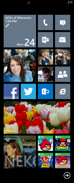
Nokia has been running a series of blog posts where they have some well-known people Share their Windows Phone start screen and talk about the apps they use most and why they have customized their device that way. This is not a new meme, I have seen folks share their iPhone home screens as well. Like Paul Thurrot, I don’t think Nokia will ask me to be a guest contributor on their site, so I thought I would share my start screen and talk about some of the choices I have made:

Note: I stitched 2 screen shots together to create the seamless look in the screenshot above. My phone is not this long and skinny. In reality, the screen ends on about 2/3rds of the way down the photos hub and you can’t see the bottom apps without scrolling.
A little drab
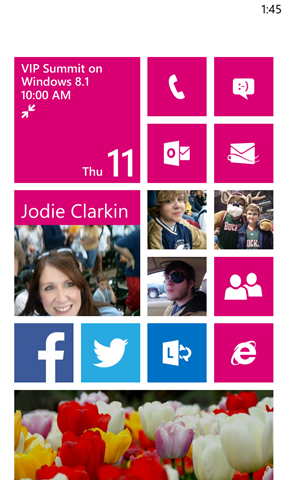
One of my co-workers asked me what my color scheme was on my phone and before I could answer they blurted out “dull and boring!” The “steel” accent color on the dark background looks a little drab, and when you combine that with the fact that I am carrying a matte black Nokia Lumia 920, it can come across as the Orwellian. I have always tended towards the gray colors myself and I do try and brighten up the screen with the tulip photos (that is a picture that I took a couple years ago – not a stock one). Being able to pick the color scheme that matches your personality (or even your mood) is something I like about the Windows Phone. In a crazy bright mood? How about Magenta on a light background (I am sure this would look awesome on a Cyan Phone):

Not a lot of apps, eh?
I don’t have a ton of apps on my phone, I can easily list all the applications I have installed: Facebook, Twitter, Netflix, Bing Translator and every edition of Angry Birds. Some people might say (in a snarky voice): “That is because Windows Phone does not have any apps!” Windows Phone is missing some notable apps that are on Android and iOS (Instagram, Path, Vine and Flipboard are probably the three most talked about), but there are plenty of good and some great apps that are on Windows Phone for a total of about 160,000+. But I don’t think I would be downloading any more apps than the ones that I have. There are two reasons and one is very notable about Windows Phone:
- Many of the things that you would use an app for are built into Windows Phone. It has great integration with my calendar, e-mail, tasks and contact databases. This is true both for Microsoft Services (like Exchange and outlook.com), but is also true for services by Google and Yahoo! as well.
- I would rather use the web than an app. Probably the number one thing I do on my phone is e-mail. Tied for second is either listening to podcasts or browsing the web (but a distant second). I would rather look at a website than download an app any day of the week. Nothing upsets me more than a company that wants me to download an app to do something mundane like get a map of their building or a list of their store hours. The mobile (responsive) web continues to get better and better and (I hope) we will soon be in a position that the mobile web will be a first class citizen and we won’t have to use apps except for the few things that require them (like shooting birds at rock and stones structures.
My favorite thing about Windows Phone?
Live Tiles – hands down. It is hard to show in a screen shot, but the Music+Videos app on the lower right of the start screen is animated with Neko Case’s picture and Name because her song was playing when I took the picture. Also the contacts that I have pinned to the start screen (my wife Jodie and my sons) will show their latest status from social media that I have wired up (Twitter and Facebook).
I would be interested to see how other people customize their screen (not just Windows Phone – iOS and Android as well). It really should reflect your personality.
PS: UFOs of Wisconsin – don’t ask.