Website update for Safari Reader
One of the things that I have been doing as I have been updating my blog template is making sure that it works and looks good in the popular browsers: Internet Explorer 8, Firefox 3.6 and Safari 5 (yes, I need to test in Chrome as well). In doing so I finally got to go hands on with new feature of Safari called Reader, which Apple shipped in June with Safari 5. I had heard good things about Safari Reader from Dave Winer and heard it was the end of the world from Jim Lynch (who writes about advertisements and other things).
What is Safari Reader?
Here is the description of Reader from the Apple site:
With Safari Reader, you no longer have to deal with annoying ads and other visual distractions that get in the way of your online articles. That’s because Safari detects if you’re on a webpage with an article. Click the Reader button in the Smart Address Field, and the article appears instantly in one continuous, clutter-free view.
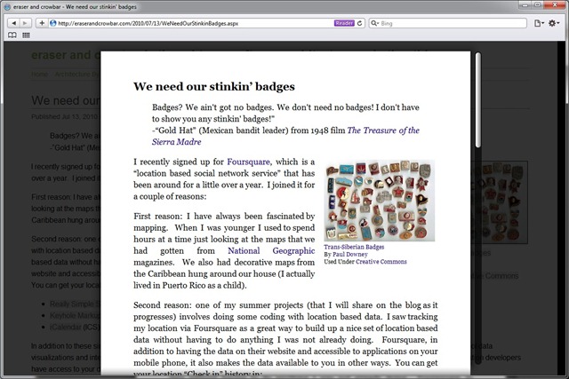
The best way to see what reader does is to look at a website with reader in use. My new layout does not have a lot of flair to it, so I figured I would show you a couple screen shots from the blog of my buddy Dave Bost. Here is one of his recent articles in Safari without the reader view enabled (note you can see the “reader” button in the address bar letting you know you can click it):
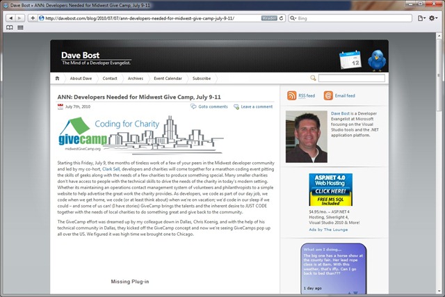
Like many blogs, Dave has a header, some navigation, some advertisements, RSS icons and even a Twitter Badge. Now click on the reader view and this is what you see:
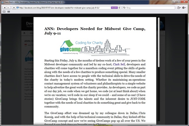
It is the same article, but all the non-article content is suppressed. It is hard to tell with the screen shot, but the text is also slightly bigger than the native size on the page aiding the readability just a bit. As I understand it, if the article is multiple pages long it will pull the content from all the pages (I don’t use Safari as my day to day browser – so I really have not seen that in action). One last thing to notice is that the Reader icon in the address bar is now a purple color, letting you know it is in reader view.
Have you taken a look at your website(s) in Safari Reader view?
Once I figured out what Reader did I was anxious to see what my site looked like with it turned on. I figured that there would not be much difference, because my new layout is pretty minimalist (I am proud of that – can you tell?). So I fired it up and here is what I saw:
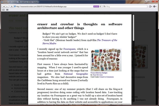
As I figured, there was not too much of a change, but then I looked carefully and noticed something missing. Did you catch it? Here is a hint:
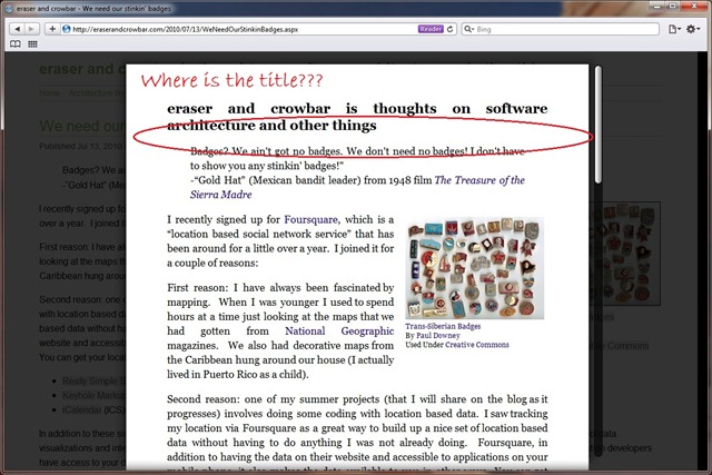
Reader had dropped my title, dismissing it as Flair! It only took me about a minute of digging to realize the problem and I discovered it in my own markup. This is how the blogging engine and template were rendering the title of the page (I did shorten the href for display):
<div class="itemTitle">
  <a class="TitleLinkStyle" rel="bookmark" href="/MeetTheNewBlog.aspx">Meet the new blog…</a>
</div>
I had not marked the title of the post with an <h2> element, but I had used an <h1> element for the title of the site as well as <h3> elements in the body of the article. Reader is using heuristics to “guess” your markup and heuristics can be quite good, but never perfect given the variability in markup across the Internet (and the Internet is pretty big from what I have heard). So I updated the template and the corresponding css for layout to add an <h2> element like so:
<div class="itemTitle">
  <h2><a class="TitleLinkStyle" rel="bookmark" href="/MeetTheNewBlog.aspx">Meet the new blog…</a><h2>
</div>
Here is what the page looks like with the updated mark-up. Much better, but you will notice that Reader has now dropped the title of the blog; I am okay with that:
Checking my site for how it looked in reader reminded me of an important lesson about the proper use of HTML Heading elements. <h1>, <h2> and all their friends are more than just for styling, they are giving semantic information about your page. It is not just that your element look like a heading (you can do that with any old <div> or element), but it should match the use on the page. It was just plain silly for me to have an <h1> and <h3> and not have a corresponding <h2>.
Hope this helps….