Pictorial Instructions
This past weekend I took a flight and I did something that I normally do not do, which is pay attention to the flight crew as they give their safety briefing. Years of air travel have given me the ability to recite the standard briefing in my sleep, so normally I read a book. One of the first things they tell you in their safety briefing is to get out the briefing card and follow along, since I was paying attention this time, I decided to play along. As I looked at the briefing card, I was struck by how much information that they could fit into such a compact space and with so few words, because they leveraged the pictorial so well. Here is a quick glimpse of one of the pictures that gives the complete procedure for opening up the emergency exits and getting out of the plane:

I have been really interested in the concept of pictures as better documentation than words for a while. I think my fascination was first spurred on by Mike Rhode’s sketchnotes. I even asked Mike about it in the Thirsty Developer Podcast Dave and I did with him last fall. I was specifically asking about pictures, graphics and typography in the design stage at the time, but I think the concept applies equally well (if not better) to the finished product. It is a great way to show the business process that a software application can support.

Multi-lingual by default?
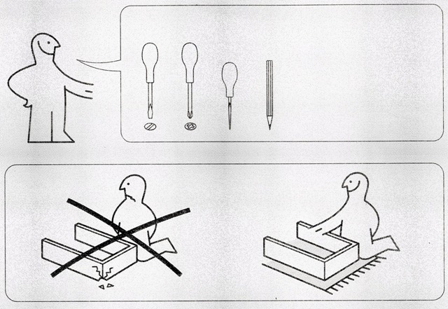
In addition to capturing lots of information in a small space, pictures done in a certain style have the advantage of being multi-lingual by default. Take the instructions that I got with the some assembly required furniture pictured here. The instructions are able to tell me a lot without using any words, and thus does not need to go through the long, tedious and expensive process of being translated to multiple languages. A real cost saving move if the product is being sold in different countries. This particular instruction manual only had one page with writing on it that needed to be translated. That one page was translated into 8 different languages, so clearly that was the intent of the designers to go global with the single document.
Not for every situation
Clearly there are times when pictorial based instructions could be overkill for a situation. I can think that the contrast to “A picture is worth a thousand word” could be “Eight words is quick than a 1/2 dozen pictures”. I do think there are situations were pictures could really enhance documentation, so maybe we can learn a thing or two by paying attention to airline safety briefings.