Adapting to the situation

I visited the Chicago Auto Show this past weekend and got to see a lot of neat displays of current and upcoming vehicles. I have gone to auto shows on and off for the past few years and one of the real trends that I have noticed is that the displays that accompany the vehicles themselves have gotten more and more interactive. In years past you would get to see 10-15 cars from a manufacturer and then would would get one or more brochures to take with you. The displays of the cars themselves are much more interactive with vehicles that are partially taken apart or turned on their side (so you can see the undercarriage). There are also a lot of computer based kiosks that you can interact with (to compare models, etc).
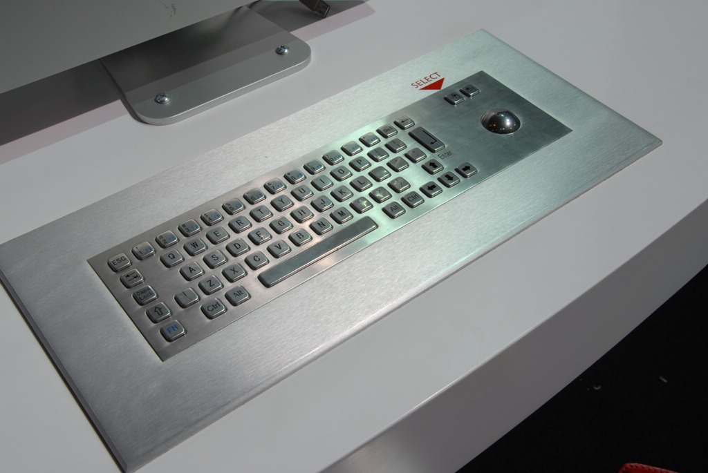
I took the above photo of one of the keyboards that was built into an interactive display (there were several similar kiosks with keyboards like this on the show floor with only minor differences). You can see that this is not your typical off the shelf keyboard that ships with your desktop machine or that you pick up at your local computer store. The profile of the keys and the overall keyboard is one of the obvious things. The hardware is specifically designed to be touched, pounded on and man-handled by the thousands of people that will use the kiosk during the course of the auto show. I did not test it out but I bet the keyboard it sealed in such a way that if you spilled a drink on the keyboard it would not break the unit; you may need to wipe it up or your fingers will get sticky :-). Clearly the company that created this display did their homework about the type of abuse that the hardware would take.
Do you observe your software in the field?
There is a lesson that we can take away from observing the kiosk systems that are designed to be used at high traffic trade shows: we need to see our applications in action before we can fully appreciate the full user experience. This does not only apply to high traffic situations like the trade show kiosks, but it applies to software being used in all situations.
I see this when I visit my local bank and see the tellers struggle to use the mouse on their narrow workspace (I think that these particular teller windows were built before PCs were common). If the software developer spent some time observing the application in practice they might build in better keyboard support to the application, or at least recommend purchasing a trackball that would be easier to use in a confined space.
Even if you are developing web applications you can learn a lot about the use of the application by watching someone use it in action. Simple observation might give you great clues to issues with your software:
- Do they use they menus that you provide?
- Do they “deep link” bookmarks/favorites/shortcuts in your application in a way that you did not expect?
- Are they running in a much smaller or larger resolution than you are testing for?
Obviously if your application is broad reaching, you are not going to be able to see even a small percentage of your population using your application, but even seeing a couple of typical users will give you great insight into things that you can improve in your application.