What stops a user from clicking?
As I have talked about previously I hate the concept of phishing. It is a problem that we need to address as an industry (technology) and as society using every means available (legal, user education and technology). Over the last couple of days I have gotten more phishing e-mails than ever (okay so I have gotten 3 in the last week and I have only ever gotten 1 before this - but it is an alarming trend). Thus far I have spotted them coming from a mile away:
-
One of them wound up in the junk e-mail folder (thank you Outlook!)
-
2 of them were account alerts from places where I did not have account
-
The last one actually had the link with an IP Address instead of a server name
In each of these cases I carefully went to the phishing link to see what I could see (be very careful if you do this). It is very refreshing what I saw when I went to one of these sites; I got a very stern warning from IE that this site was indeed a phishing site:
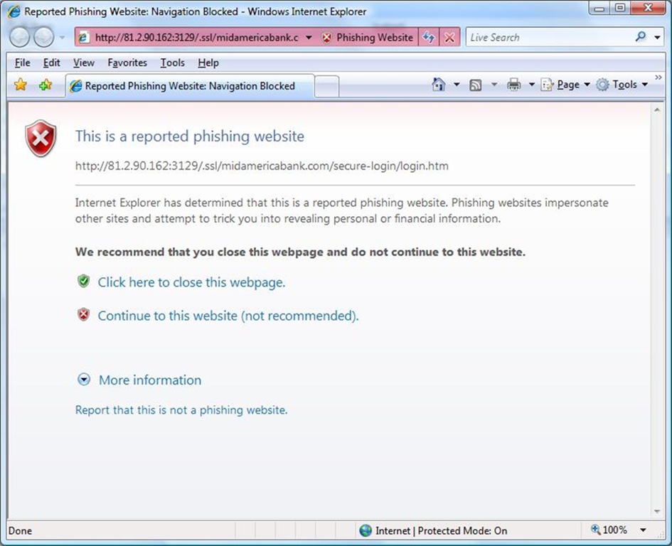
And just so that I don’t seem like I am the Microsoft guy patting the IE team on the back, Firefox gave me a similar warning:
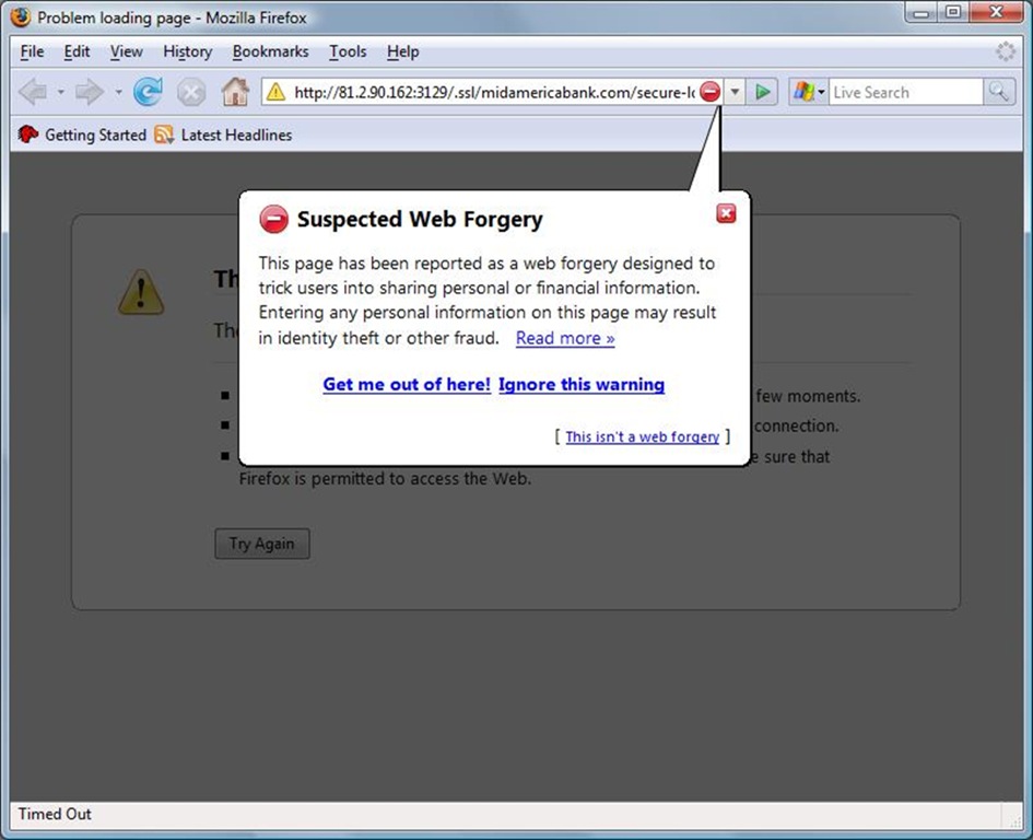
I love the use of color and symbols in both of these implementations. IE uses a little more RED than Firefox does, but the Firefox symbol has a slight edge over the IE one in that it would be more universally understood than the shield type symbol. All and all they are both good implementations of warnings, but they still allow the user to accept the risk and continue onto the website.
Are the warnings enough?
At some of our recent ArcReady programs we asked how many people in the audience had purchased something from a website with a ”red” address bar in Internet Explorer (that is a general purpose warning and could mean things other than a phishing attack, but in general it is never good!). I was surprised that in every audience we got a few hands raised. Josh made a point of telling those people to call their bank and cancel that credit card. I think there is a natural tendency to “click away” warnings as soon as they appear, especially when we have an emotional desire to get to our destination (and phishing e-mails feed on those emotional desires).
From a User Experience (UX) standpoint there are are several things that we could try to do in this situation:
-
Redesign the interface to make the message even more clear (There is some tweaking we could do, but we are pretty much at the point of diminishing returns)
-
Annoy the user my asking them “are you really sure?” (yeah - that would suck)
-
Take the drastic step to say that out of social responsibility we should not let the user access the site (that is pretty hard core decision to make)
-
Some variation of the above (like by default it will not allow you to go to the site, but you could configure it to allow it)
I don’t have the answer here, just thought I would ask the question “What stops a user from clicking?”